Our showcases reveal how we transform brand challenges into memorable stories that connect with audiences across diverse industries.
Brand Identity, Social Media Strategy & Content Creation.
Brand Unification
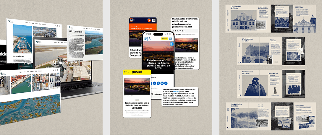
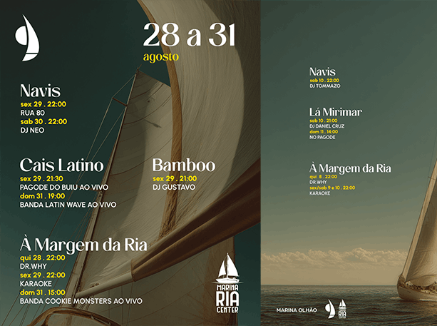
An in-depth brand identity for Marina de Olhão, bridging its sub-brands into a single, cohesive system. From digital platform implementation to ongoing marketing strategy and content creation, across the full range of services the marina has to offer.
Brand: Marina de Olhão
Sector: Nautic Tourism
Title: "One Identity, Multiple Voices"
Marina de Olhão is more than a marina. It is where Olhão's fishing tradition meets the future of nautical tourism in the Algarve. Nestled in the heart of the Parque Natural da Ria Formosa, it brings together a modern, sustainable nautical complex and the Marina Ria Center, a space where restaurants, bars, stores and experiences share the same shore. Our role was to bring all of this under one single, coherent brand that could speak for the whole.
The Marina Ria Center and the Porto de Recreio de Olhão each had an identity of their own, but shared no common thread. That is where we stepped in, creating a parent brand for Marina de Olhão: the geographical and symbolic home that brings both entities under one coherent identity, while each retains the freedom to function independently. This same logic extended to the digital platforms, where a unified social media presence and website became a single point of entry for everything the marina has to offer.
We act as the bridge between Marina de Olhão and its diverse audiences: locals, tourists, marina users, and media. Through consistent content creation for social media, press relations, and strategic storytelling, we promote both the Ria Center and the marina's nautical services while strengthening the connection with Olhão's community. Our role extends beyond communication; we're the voice that brings together everything the marina represents, translating its offer into meaningful engagement across all touchpoints.
Market Research → Sub-brands Analysis → Audience Analysis → Tone of Voice Guidelines → Branding for Marina de Olhão & Porto Recreio → Visual Identity → Ongoing Content Creation and Social Media Management → Press Relations & Municipal Partnerships
Rebranding, Visual Identity, Signage & Space Design, Website
Living Heritage
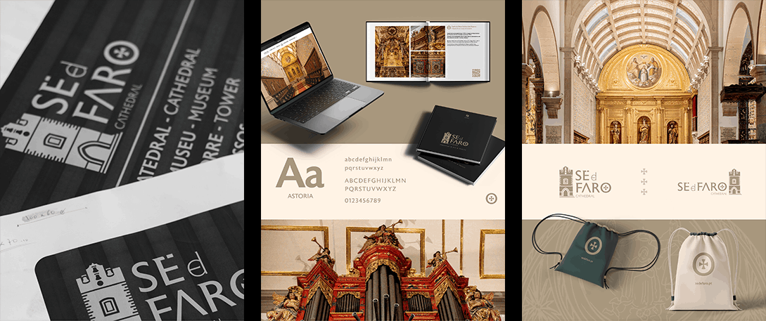
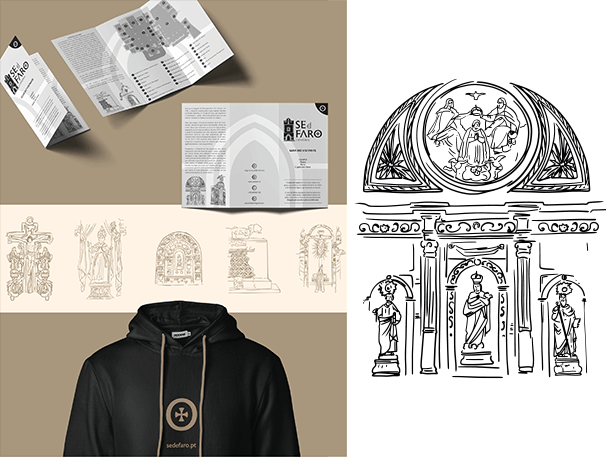
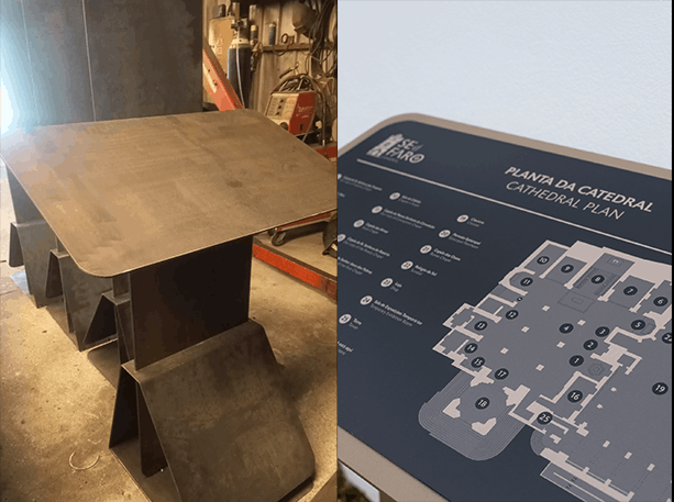
Sé de Faro has stood at the heart of the city since the 13th century. A National Monument, the seat of the Diocese of the Algarve, and one of the most visited cultural landmarks in the south of Portugal. The story was already there. Our work was to express it, with consistency and without losing its essence. A new visual identity, a dedicated website and a signage system that finally gave one of Portugal's most significant heritage institutions the presence it deserved.
Brand: Sé de Faro
Sector: Heritage
Title: “History, Carved in Identity”
A heritage institution carries a particular weight: history as identity, tradition as constraint. The challenge was not to reinvent the Sé de Faro, but to give it a contemporary voice without erasing the centuries behind it. To maintain a respectful and careful dialogue with everything it represents, while creating a visual system that could travel across digital media, print, and signage with the same clarity and authority. A solid, lasting brand that reflects its role, religious and historical, in the story of Portugal.
Looking at the Sé's façade, we distilled its key components into their most essential forms, adding stones framing the bell tower to represent the eleven Baroque and Gothic chapels within, turning a structural detail into a mark of everything the cathedral holds inside. The color palette was drawn directly from the cathedral itself—the warm tones of the stone that supports Sé de Faro and the distinctive green of the bells. Typography and iconographic work followed the same direction, balancing a modern image with a deeply historical one. The icon is a graphic representation of a symbol carved throughout the cathedral's stone, representing the Order of the Temple (Templars) and the Order of Christ, dating back to the reconquest of Faro in 1249 by King Afonso III.
One of the main goals was to create visual consistency across every format, from physical signage to online communication, including a dedicated website. A cleaner, more unified image for the Sé de Faro made that possible, consolidating its identity not only as a cultural landmark, but as a symbol of faith and a reference point in Portuguese culture. With that came a significantly stronger influx of visitors and, for the first time, a presence that truly matches the weight of what the Sé represents.
Historical, Cultural & Religious Research → Market Research → Brand analysis and principles → Target Audience → Storytelling → Branding → Visual Identity → Signage & Space Design → Digital platform implementation
Storytelling, Rebranding, Label Design, Content Creation & Social Media Strategy
Two Chairs. One Story.
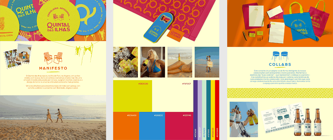
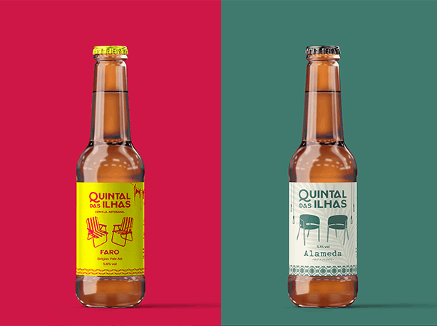
Quintal das Ilhas is a craft beer brand born in Faro Island, Algarve, built on friendship, a shared passion for artisanal brewing and the sun-soaked lifestyle of the south. Two friends, two beach chairs and a conversation that never really ended, all of it bottled into a brand. We rebuilt that identity from the ground up, and the impact showed: a social media following that keeps climbing, collaborations/partnership with restaurants, bars and retails.
Brand: Quintal das Ilhas
Sector: Craft Beer Sector
Title: "Faz a tua praia."
Quintal das Ilhas didn't start out as you see it today. The original name and branding hinted at the idea of a beer born on an island, but it needed to grow, to reach new horizons. It needed a more authentic image, one that captured the "life is a beach party" lifestyle, the warmth and the spirit the founders actually wanted to convey. Younger, more versatile, more laid-back, with a wave-riding, sun-soaked groove to it. And most importantly, it needed to find its people. From a strategic social media presence to appearances at conferences, fairs and festivals, we helped Quintal das Ilhas get the recognition it deserved.
We shaped this brand around two chairs and everything they stand for. Not a logo trick, not a gimmick, a real moment between two friends on a beach, beers in hand, watching the horizon. That image became the foundation for everything. We studied the craft beer landscape in the Algarve and across Portugal, understood the audience that a brand like this deserves, and from that came a clear path. Every collaboration with a restaurant or bar gets its own version of the chairs, reflecting the character of each establishment. Every in-house beer gets chairs that tell the story of that specific brew. The result is a visual system that grows with every label, every partnership, every story, without ever losing what makes it Quintal das Ilhas.
What we brought to the table:
Storytelling
Brand concept and visual identity;
Label design system and development;
Photography & Video;
Social media strategy, implementation and Content Creation;
Event presence and activation strategy;
Collaboration framework for partner establishments;
Brand guidelines and tone of voice.
Market Research → Concept & Brand Fundamentals → Audience analysis → Storytelling → Tone of Voice Guidelines → Branding → Visual Identity → Label Design System → Content Creation and guidelines → Photography & Video → Social Media Strategy & execution → Partnership activation
Branding, Storytelling, Social Media Strategy & Content.
The impossible space between worlds.
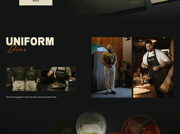
Set out to convey more than a restaurant, a story built from memories and lived experiences, we worked hand in hand with the chef and founder through everything. From visual identity and narrative to interior concept and tone of voice. From photography and video to the choice of tableware, lighting and uniforms. Every detail carries the same intention. And you can sense Brecha in all of it. This showcase reveals how that narrative found its way into every corner of the brand.
Brand: Brecha
Sector: Food & Hospitality
Title: “Entra. Sente. Fica.”
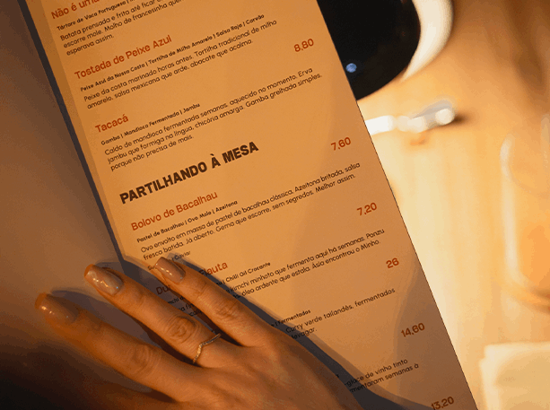
Building a restaurant brand that lives in the impossible space between fine dining and the everyday, without falling into either. Brecha's identity is rooted in memory, heritage and borderless technique, and translating a concept this layered into a cohesive experience across every touchpoint was the core challenge. Our approach was to let the story breathe through everything: from naming and narrative to menu copywriting, space curation and visual production, positioning Brecha clearly apart from the wave of superficial "gastrocultural" restaurants and finding the audience that deserved it as much as it deserved them.
We crafted this brand around real gastrocultural experiences. Purposeful, honest and grounded, without ever making it feel out of reach. Brecha is the porous border where two worlds touch without erasing each other. That impossibility had to live in the identity too. Every visual choice was made to feel like a pause, like a sliver of light coming through. Earthy, grounded and quietly present. Building a brand is never just about logos. We studied the market, analysed the hospitality landscape in the north of Portugal, and researched the audience that a place like this deserves. From that came a clear path, a strategy built not only for social media, but for real life, including events that further elevated the gastrocultural experience and built genuine connections between Brecha and everything around it.
What we brought to the table:
Storytelling
Brand concept and visual identity;
Food and Wine menu design;
Website design and development;
Photography & Video;
Scriptwriting and working with a local production company;
Social media strategy, implementation and Content Creation;
Service approach and Staff Communication Guidelines;
Consulting: Interior Design, Tableware and Playlist Curation.
Market Research → Concept & Brand Fundamentals → Audience analysis → Storytelling → Tone of Voice Guidelines → Branding → Visual Identity → Uniform Design → Interior Design Consultation → Digital platform implementation → Content Creation and guidelines → Brand activation → Marketing Campaign & execution
"In the geography of the soul, brecha is the porous border where two worlds touch without cancelling each other out. The place that shouldn't exist, but does. We inhabit the impossible space between untouchable fine dining and the humble neighbourhood tavern. Technical rigour without suffocating formality. Exceptional produce without elitism. Attentive service without artificial distance."
Enter. Feel. Stay.
Campaign & Event Strategy. Design and Video production.
Bringing Local Heritage to Life.
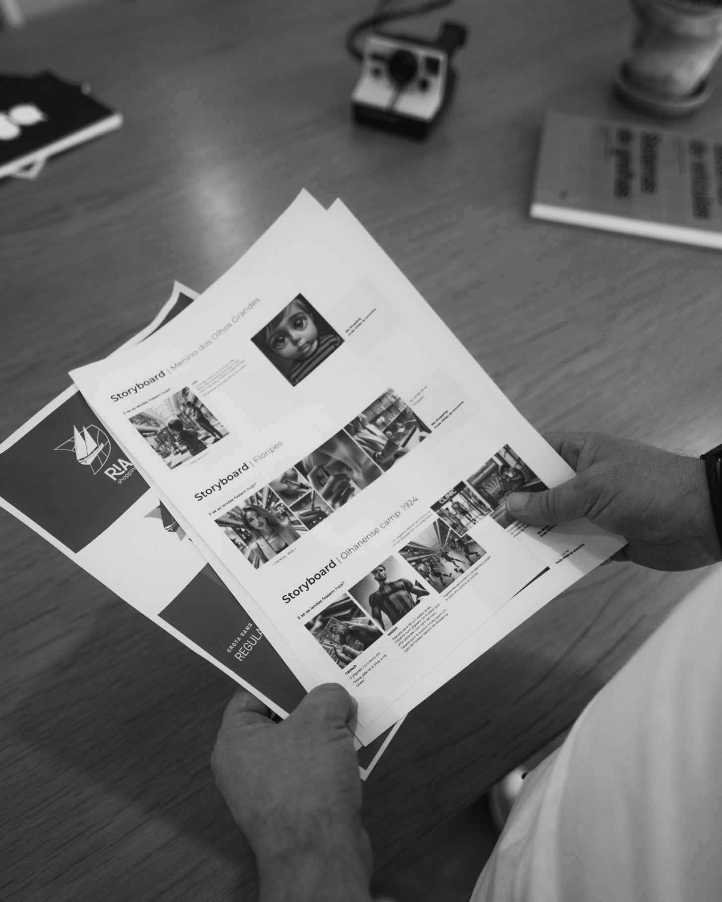
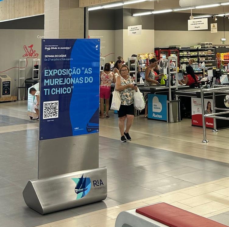
A multi-video campaign for Ria Shopping that transformed ancient legends into contemporary narratives. Series of 20-second videos reimagining historical stories of Olhão as if they happened today, connecting the shopping center with the city's cultural identity through immersive in-mall experiences.
This showcase reveals a cohesive visual identity across videos, print materials, and in-mall graphics, turning folklore into a modern brand connection point that resonated deeply with locals while attracting visitors through authentic storytelling.
Brand: Ria Shopping
Sector: Shopping Center
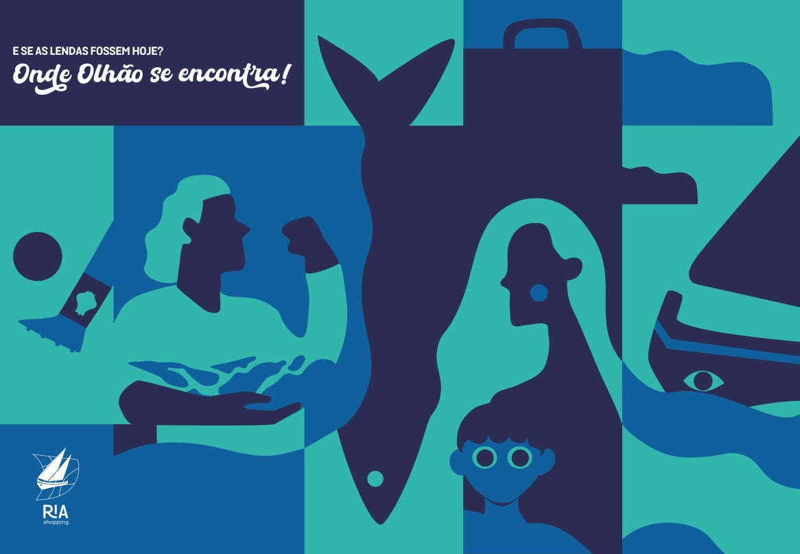
Title: "Onde Olhão se encontra"
Creating an emotional connection between Ria Shopping and the local community by transforming the perception from a simple retail space into a cultural landmark. Our strategy merged strategic storytelling with Olhão's rich cultural heritage, reimagining local legends in contemporary settings and connecting them directly to the shopping center's stores and services through a visually cohesive campaign that extended from digital to physical spaces
Research of local legends →Creative concept development → Audiovisual production →
Implementation in digital and physical spaces
A distinctive campaign imagery using a conceptual, almost surrealist aesthetic that blended mythical elements with modern shopping environments. This visual approach created an immediate recognition factor while emphasizing the dreamlike quality of legends brought into contemporary settings.
Floripes : Enhancing her beauty to break an ancient spell, today's Floripes visits the shopping center's beauty stores and services.
Arraúl : Legendary character known for his strength, Arraúl today practices bodybuilding at the shopping center's gym. So strong he could build the barrier islands.
O Menino dos Olhos Grandes (The Boy with Big Eyes): Legendary child who would become heavy and impossible to move, is now a stubborn child who refuses to leave.
Caíque The caíque, beyond being a symbol of the shopping center, is also a symbol of Olhão and its most vibrant happenings. An experience that travels through time.
Conserveiras: Mid-20th century Olhão was an important hub for the canning industry. Many came in search of the Olhanense canned treasure.
Olhanense Football Club: The local club founded in 1912, has always been present throughout Olhão, today, throughout the shopping center.
Brand Architecture & Digital Identity. Social Media Management.
Diverse Storytelling.
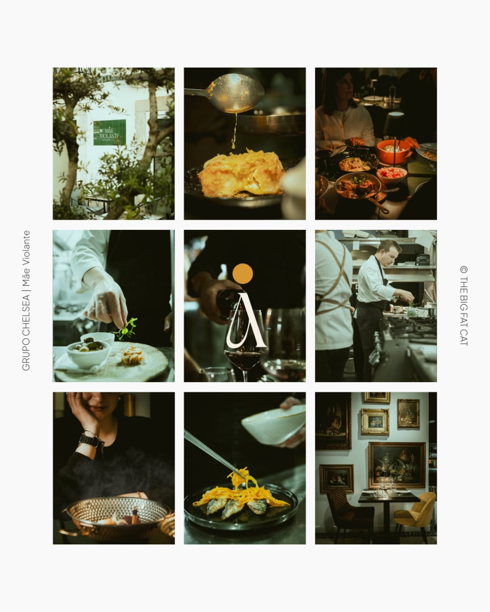
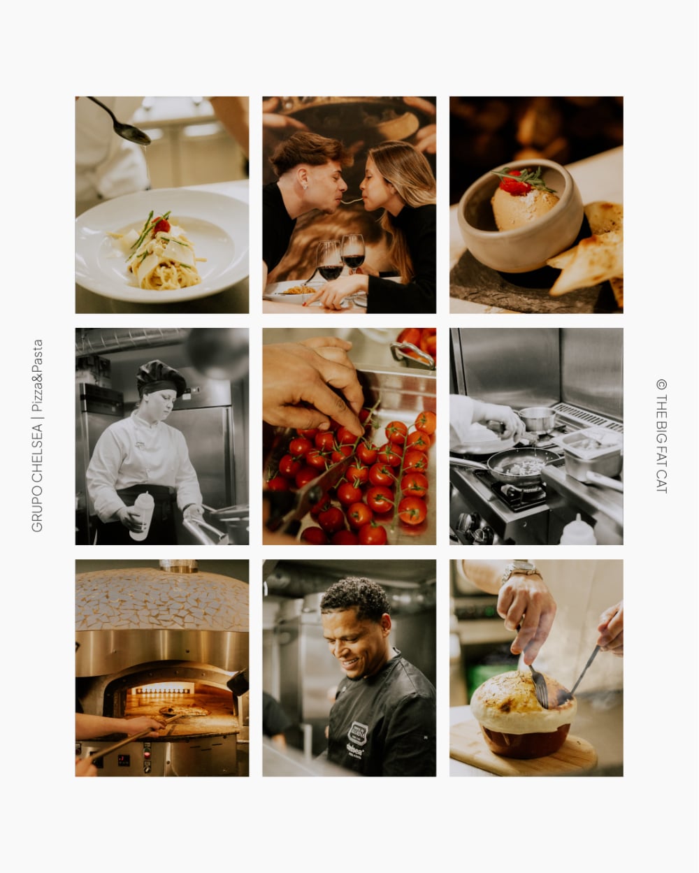
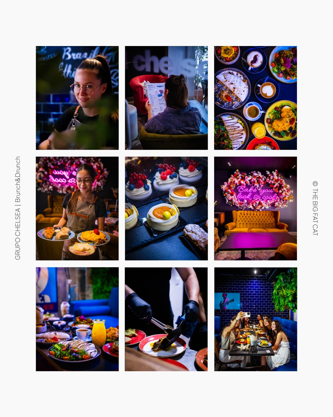
A comprehensive storytelling project for a diverse restaurant group in Faro, encompassing five distinct dining concepts: a traditional Portuguese restaurant, a cosmopolitan brunch café, an Italian restaurant, a neighborhood bakery with an artisanal twist, and a gelato shop. This showcase reveals our strategic approach to creating a cohesive brand architecture that maintains the unique identity of each establishment while building a recognizable parent brand.
Brand: Grupo Chelsea
Sector: Food & Hospitality
Title: "Five Personalities"
Creating distinctive personalities for each venue while ensuring brand cohesion across the group. We developed a brand architecture that positioned each establishment with its own character and story, connected by shared visual elements and a unified storytelling approach that emphasized authentic culinary experiences.
We created five distinct brand personalities, each with their own voice and visual expression:
Mãe Violante - A traditional Portuguese restaurant embodied by a wise 70-year-old woman who shares culinary and life wisdom without nostalgia.
Chelsea Coffee Brunch - A cosmopolitan café represented by a well-traveled woman in her 30s who values human connection.
Pizza & Pasta - An Italian restaurant with art-covered walls, voiced by an art-loving, well-traveled man in his 30s, incorporating Italian phrases.
Chelsea Padaria & Croissanteria - A neighborhood bakery with an artisanal twist, represented by a mature man deeply connected to Faro.
Gelataria Chelsea - A vibrant gelato shop characterized by a colorful, extroverted woman in her 20s.
Each establishment received its own visual identity and storytelling framework while maintaining subtle connecting elements. The parent brand provides quality assurance while allowing each venue to speak directly to its specific audience through a distinctive personality.
Digital Presence & Social Media:
Our strategy transformed the group's digital footprint by:
Creating content that reflects each venue's unique personality and culinary focus
Developing distinct visual aesthetics that remain part of a cohesive family
Implementing coordinated content calendars that balance individual promotion with group-wide messaging
Crafting storytelling frameworks highlighting the culinary traditions, ingredients, and experiences unique to each venue.
Brand positioning analysis → Persona development → Visual identity design → Tone of voice guidelines → Digital strategy implementation → Ongoing content creation and management
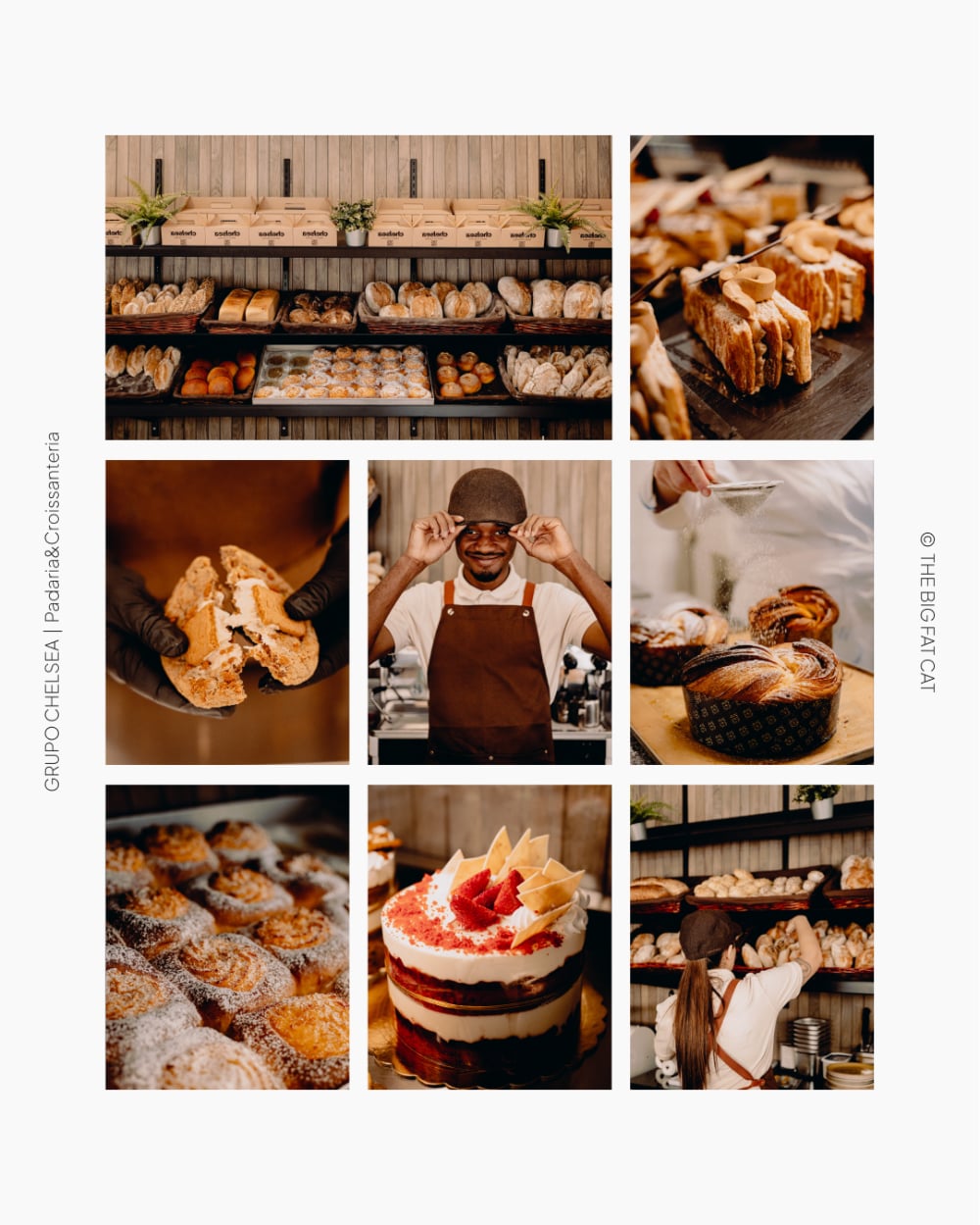
"E por um momento, das mesas perto da janela, observa-se o pulsar da avenida. No prato, um croissant que testemunha o despertar da cidade, onde turistas curiosos se misturam aos locais apressados numa dança urbana que só quem vive Faro compreende."
Chelsea Padaria & Croissanteria
"Há mesas que guardam histórias antes mesmo de serem postas. Este 'reservado' de sábado à noite é mais que uma placa - é a promessa de um jantar que ficará na memória de alguém."
Mãe Violante
"Ciao bella 💖
A mesa torna-se o cenário perfeito para uma história a dois. Entre um fio de esparguete e um brinde silencioso, o romance está nos detalhes, na partilha, no sabor e na companhia.
Buon appetito!"
Chelsea Pizza & Pasta
"Passa a nossa porta mágica e prova o melhor brunch da cidade.
Just like magic."
Chelsea Coffee & Brunch
Event Branding & Promotion. Digital Strategy.
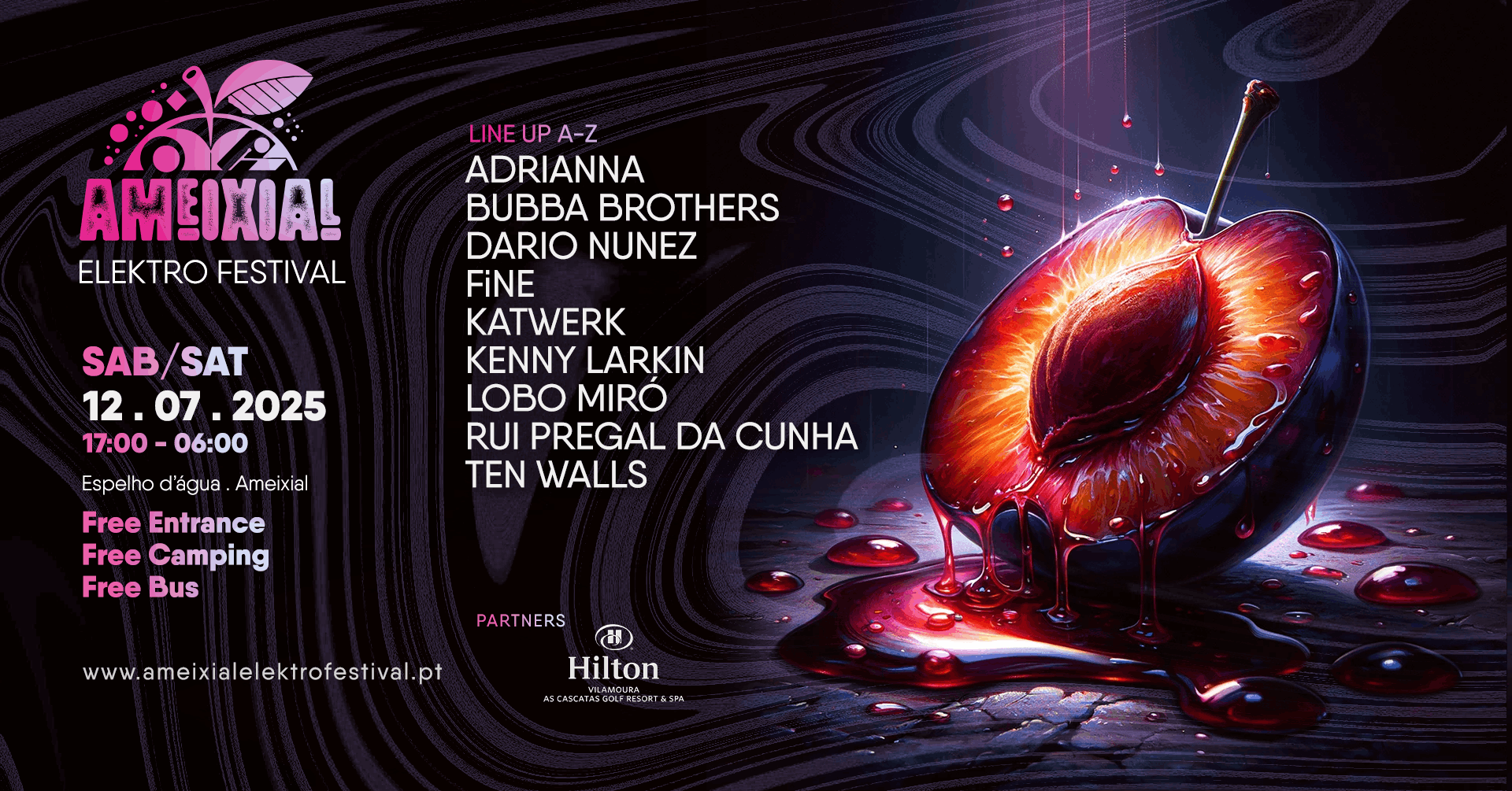
Electronic Music Meets Rural Authenticity
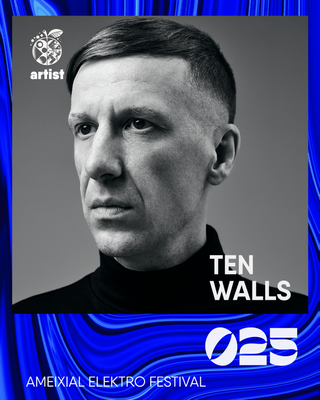
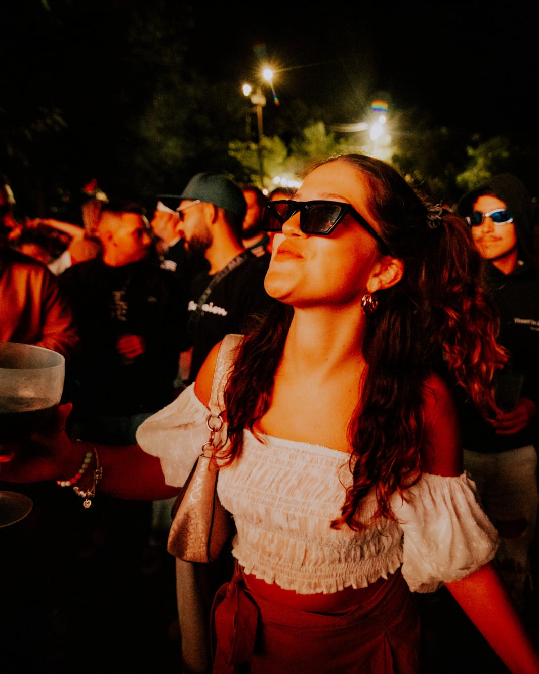
A comprehensive event branding and promotion project for a unique electronic music festival set in the rural village of Ameixial. For the second consecutive year, we've developed the complete brand identity, storytelling, and marketing strategy that brings this unexpected cultural experience to life in the Algarve's countryside.
Brand: Ameixial Elektro Festival
Sector: Music & Events
Title: "Where music and nature dance under the same sky."
Creating an authentic festival identity that bridges the contrast between cutting-edge electronic music and the traditional rural setting of Ameixial. Our approach focused on developing a distinctive visual language and narrative that celebrates this unique juxtaposition while effectively promoting the event across all platforms.
We crafted a brand story that positions the festival as a contemporary musical experience, where it intersects with the authenticity of rural Portugal. The visual identity and messaging emphasize this harmonious contrast, creating an engaging narrative that attracts music enthusiasts to a natural environment.
Our work encompasses:
. Brand concept and visual identity development
. Website design and development
. Comprehensive digital marketing and social media strategy
. Promotional materials across digital and print platforms
. Event video & photography documentation
. Storytelling that connects the music experience with the unique location.
Concept development → Visual identity creation → Digital platform implementation → Marketing campaign execution → Event coverage and documentation
Social Media Strategy & Content Creation.
Building Strategic Storytelling
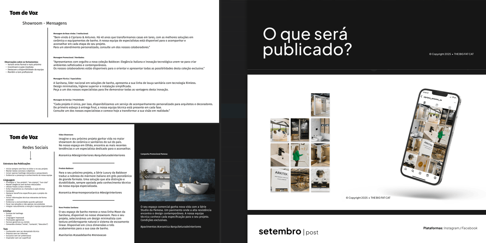
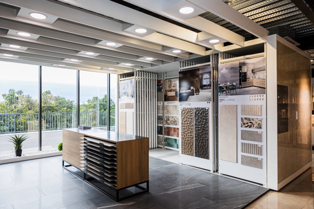
A comprehensive 12-month social media strategy and content production project for a construction materials store. We developed a complete framework for digital storytelling that highlights the company's expertise, projects and values.
Brand: Cipriano & Antunes
Sector: Building Materials Retail
Title: "Constructing Connections Beyond Materials"
Transforming technical expertise into social media content that reaches contractors, architects, decorators and end clients alike. Our approach focused on developing a content strategy that balances product knowledge with inspirational storytelling, highlighting materials, projects, applications, expert advice and brands.
We worked closely with Cipriano & Antunes' marketing department to develop a self-sustainable social media framework that they could implement independently while receiving our ongoing consultancy. This included establishing content pillars, visual guidelines, and narrative approaches that showcase the company's expertise and customer-focused values.
Our strategy delivered:
. Defined content pillars and themes for 12 months of consistent storytelling.
. Visual style guide for social media content.
. Content templates and production guidelines.
. Editorial calendar with strategic content mapping.
. Training and consultancy for the internal marketing team.
. Measurement framework to evaluate content performance.
Brand and audience analysis → Content strategy development → Visual style creation → Production of example content → Implementation guide → Ongoing consultancy
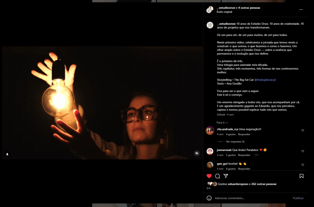
Documentary & Brand Storytelling. Audio-Visual Production.
Revealing the Human Side of Creative Artistry
A three-part documentary series exploring an artistic collective that creates contemporary signature tattoos, urban art and sculptures, painting, curation and marketing applied to art. Through intimate storytelling, we captured the intersection between art, personal expression and culture.
Estúdio Onze "A Identidade" Ep1
Estúdio Onze "Quem" Ep.2
Estúdio Onze "O Coletivo" Ep3
Brand: Estúdio 11
Sector: Creative Arts & Culture
Title: "Intersection between art, personal expression"
Creating a visual narrative that showcases both the commercial and artistic dimensions of Estúdio 11 while revealing the personal stories behind the collective. Our challenge was to balance the promotional needs of the studio with authentic storytelling that captures the essence of their sustainable, heritage-driven approach to art.
We developed a three-episode documentary structure that progressively deepens the audience's understanding of the collective:
Episode 1: "A Identidade" (The Identity)
The commercial face of Estúdio 11 - introducing their services, workspace, and artistic practices. Functions as both documentary and promotional content.
Episode 2: "Quem" (Who)
Personal portraits of the three collective members - Miguel Martins (founder and multidisciplinary artist), Ana Goulão (project manager and artistic consultant), and Edgar Pacheco (multidisciplinary artist and tattoo artist). Individual stories revealing the people behind the art.
Episode 3: "O Coletivo" (The Collective)
Entirely edited from the final group interview, this episode explores the dynamics of their collaboration, relationship, and collective creative process without additional visual elements.
Through four strategic interviews (three individual, one collective), we developed a storytelling framework that reveals both the individual personalities and collective synergy of Estúdio 11. The documentary progression moves from external presentation to internal truth, creating an authentic portrait of artistic collaboration, serving as promotion for the collective's work.
Interview planning → Individual and group sessions → Content architecture development → Three-episode narrative structure → Post-production storytelling
Rebranding & Storytelling. Brand Heritage & Visual Identity.
Bridging Past and Present Through Timeless Hospitality
A comprehensive rebranding project for Dom José Beach Hotel that honored its founding story while modernizing its identity for contemporary audiences. Through strategic storytelling, we connected the hotel's heritage from the 1950s to its present-day excellence, creating an authentic brand narrative that resonates across generations.
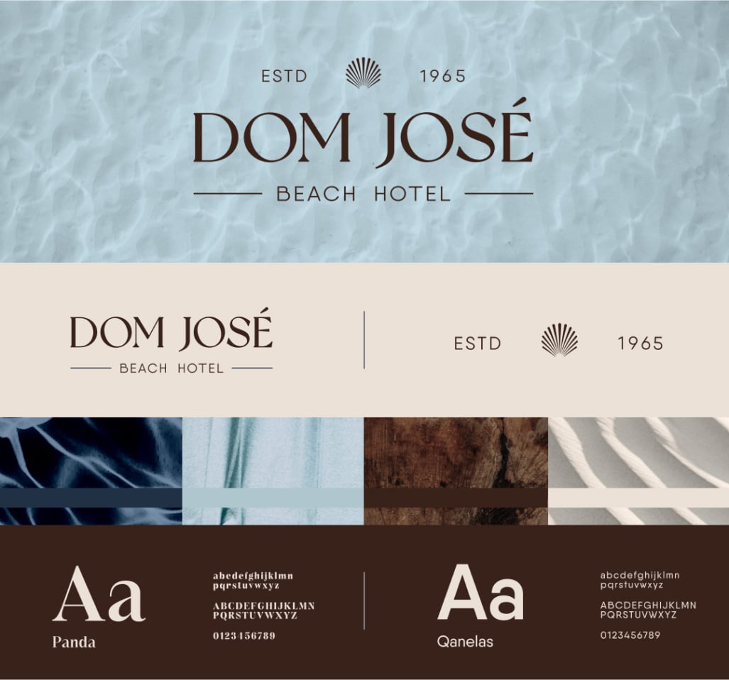
Brand: Dom José Beach Hotel
Sector: Hospitality & Tourism
Title: "From 1950s Vision to Modern Experience"
Transforming a historic hotel's identity while preserving its authentic heritage story. Our challenge was to create a modern brand that honored the founders' original vision while appealing to today's travelers. We developed a comprehensive storytelling strategy that bridges past and present through visual and narrative elements.
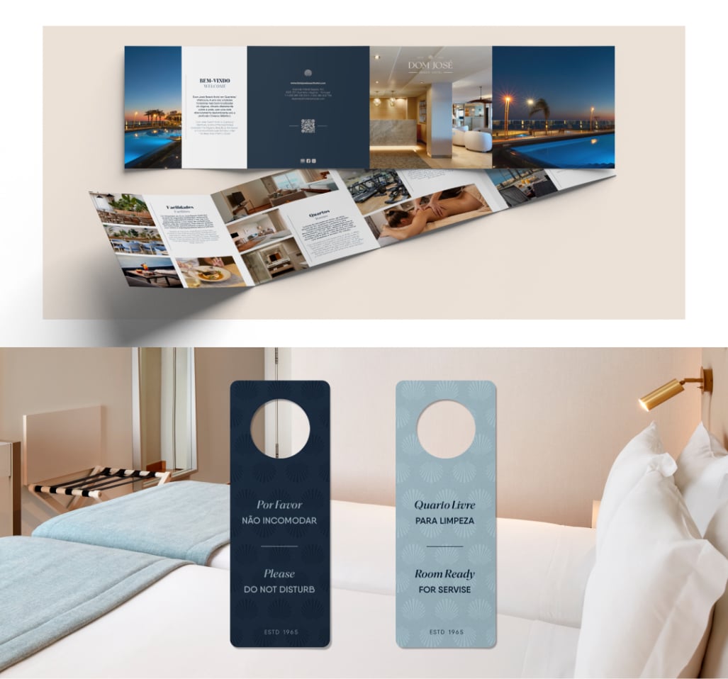
Our comprehensive rebranding included:
. New logo design that reflects both heritage and modernity.
. Complete brand identity system and visual guidelines.
. All hotel assets from stationery to digital presence.
. Marketing materials that tell the founding story.
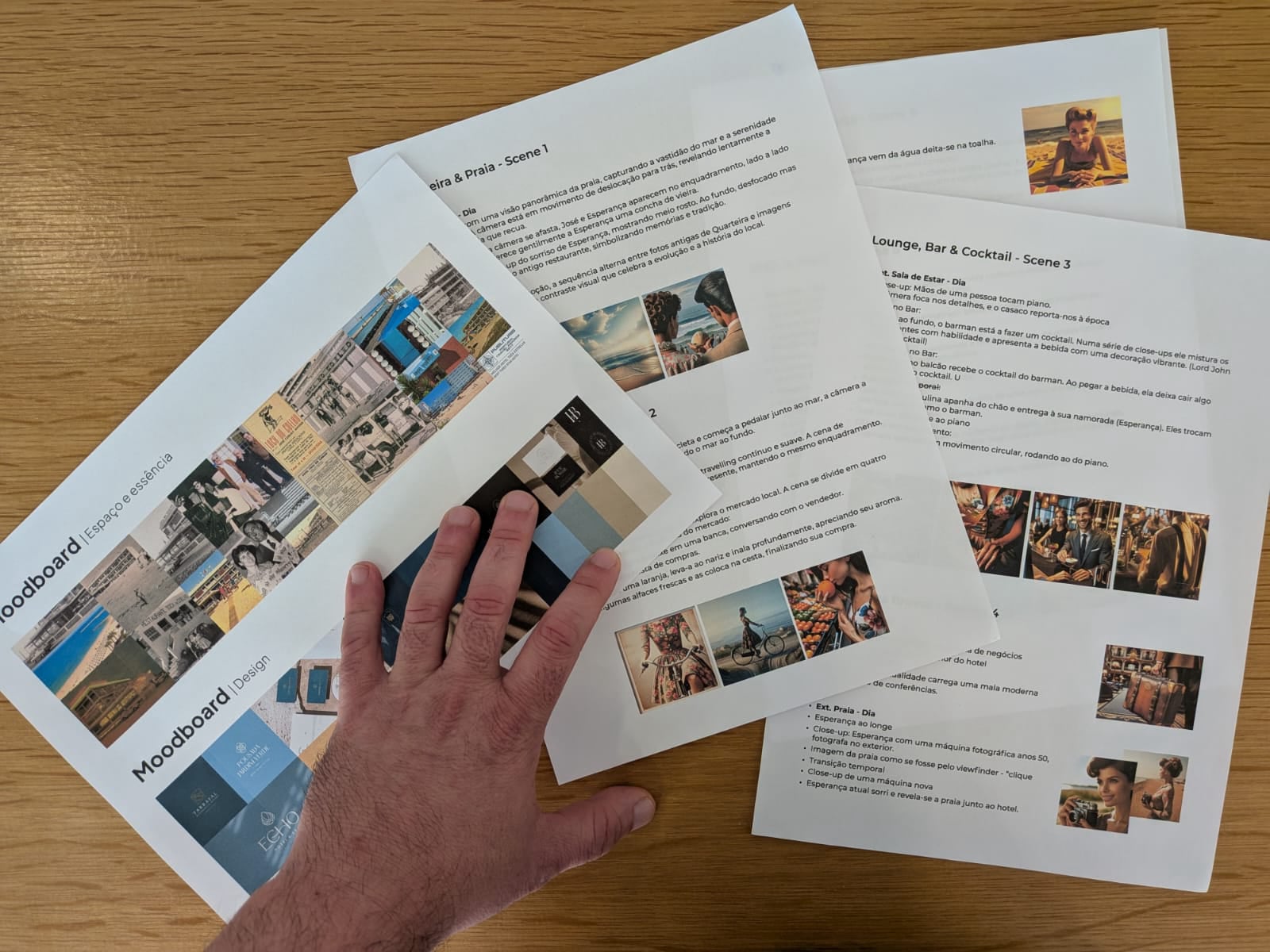
We created a series of short films featuring the same actors portraying José and Esperança across two time periods - the 1950s founding era and the present day. These videos seamlessly transition between past and present, showing how the hotel's values endure while its services evolve. Each video showcases different aspects of the hotel while reinforcing the brand narrative.
Historical research → Brand story development → Logo and identity design → Asset creation → Video concept development → Period costume and set design → Production and post-production
Music Video Production. Visual Storytelling & Conceptual Direction.
Translating Poetry Into Visual Narrative
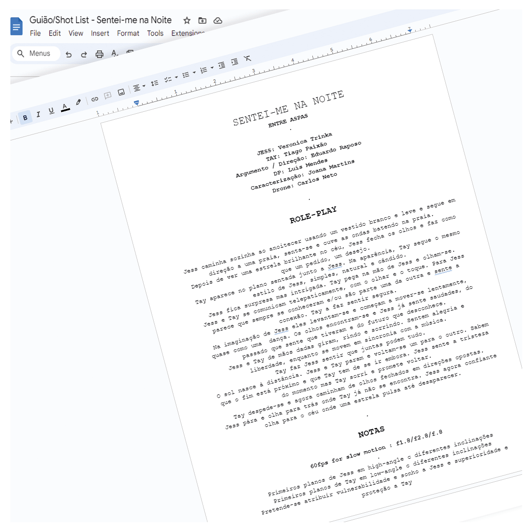
A conceptual music video for "Entre Aspas" interpreting the song "Sentei-me na noite" through visual storytelling. We created a metaphysical narrative about connection and transcendence, where a character from another world—represented initially as a star—appears to a woman on a beach, developing a profound bond that bridges earthly and celestial realms.
Brand: Entre Aspas
Sector: Music
Title: "Sentei-me na noite"
Translating poetic lyrics into a visual narrative that maintains the song's emotional depth while creating a compelling cinematic experience. Our challenge was to represent an otherworldly love story that feels authentic and universally relatable, balancing the mystical elements with genuine human connection.
Location: Praia de Monte Clérigo, Aljezur.
Narrative Arc: From solitude to connection to bittersweet farewell
Visual Metaphors: Star transforming into human presence, telepathic communication
Cinematography: Ethereal natural lighting capturing both dawn and dusk
Dance & Movement: Synchronized movement representing cosmic harmony
Our Blindsniper division brought this vision to life:
Production: BlindSniper
Script & Direction: Eduardo Raposo
Cinematography: Luis Mendes
Cast: Verónica Trinka as Jess, Tiago Paixão as Tay
Drone Cinematography: Carlos Neto
Visual Effects: José Carvalho & Miguel Fragoso
Makeup/Styling: Joana Martins
Lyrical analysis → Concept development → Storyboard creation → Location scouting → Cast direction → Cinematographic execution → Post-production visual effects → Final storytelling edit
We developed a complete brand identity for award-winning pastry chef Filipe Martins, translating his innovative artistry into visual language. Our storytelling strategy balances technical precision with creative expression, honoring traditional Portuguese pastry heritage while showcasing modern innovation.
Currently developing: A documentary capturing Filipe's creative process, from traditional techniques to contemporary interpretations of Portuguese confections.
A promotional documentary following octopus commerce from Algarve's fishing boats to international markets. We captured the complete journey—sea expeditions, professional interviews, factory processes, and export operations—revealing the story behind this traditional maritime industry.
An authentic portrayal of how traditional fishing meets modern commerce.
Our signature [No Comment] style captured the raw essence of musician Tércio Nanook's festival day in Faro. From morning rehearsals to late-night performances, this unfiltered visual narrative lets authentic moments form the story—no narration needed.
An intimate documentary project revealing the daily reality of animal shelter life in Loulé. Through careful visual storytelling, we captured both the challenges and hope that define rescue work, creating emotional connections without sensationalism.
This project demonstrates our commitment to meaningful storytelling for important causes.